Independent concept · Figma · 2026
Customer Access — Insurance UX Concept
A clearer way to understand coverage, payments, and account activity. I explored how a customer account experience could make essential policy information easier to find, understand, and act on, across desktop and mobile.
Independent UX/UI concept inspired by Mutual of Omaha. Not commissioned by, affiliated with, or endorsed by Mutual of Omaha. Screens use fictional customer and policy information.
01The challenge
An insurance account can involve policies, coverage amounts, payments, documents, and service requests. Bringing those details together in a useful way is an information-design problem. I focused on three questions a customer might have when they open their account:
- Is my coverage active?
- When is my next payment due?
- How do I get to the action I need?
These are design hypotheses, not findings from completed customer research.
02Design objectives
- Clarity — make important account details recognizable without searching through multiple screens.
- Consistency — repeatable patterns for buttons, cards, typography, status labels, and spacing.
- Accessibility — readable content, visible status, predictable navigation, and keyboard-friendly interactions.
- Responsive design — adapt the hierarchy and common tasks to a narrower mobile viewport.
03Design system foundations
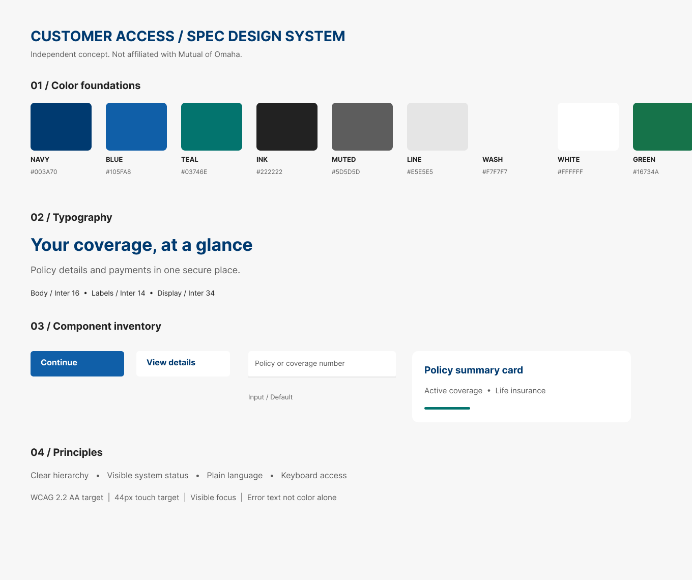
I started with a small design foundation rather than treating every screen as an isolated composition. A blue and teal palette gives structure and identifies primary and secondary actions; Inter keeps digital typography readable; and repeatable spacing values keep the relationships between headings, labels, controls, and cards predictable. Primary and secondary buttons are built as reusable Figma components, with input and policy-card treatments that could be formalized into additional component families. The initial foundations contain:
- Nine concept color variables
- Six spacing variables
- Primary and secondary button components
- Typography examples
- Form-field and policy-summary visual patterns
Design-system exploration — initial foundations, not an official or complete production library.
04Desktop dashboard
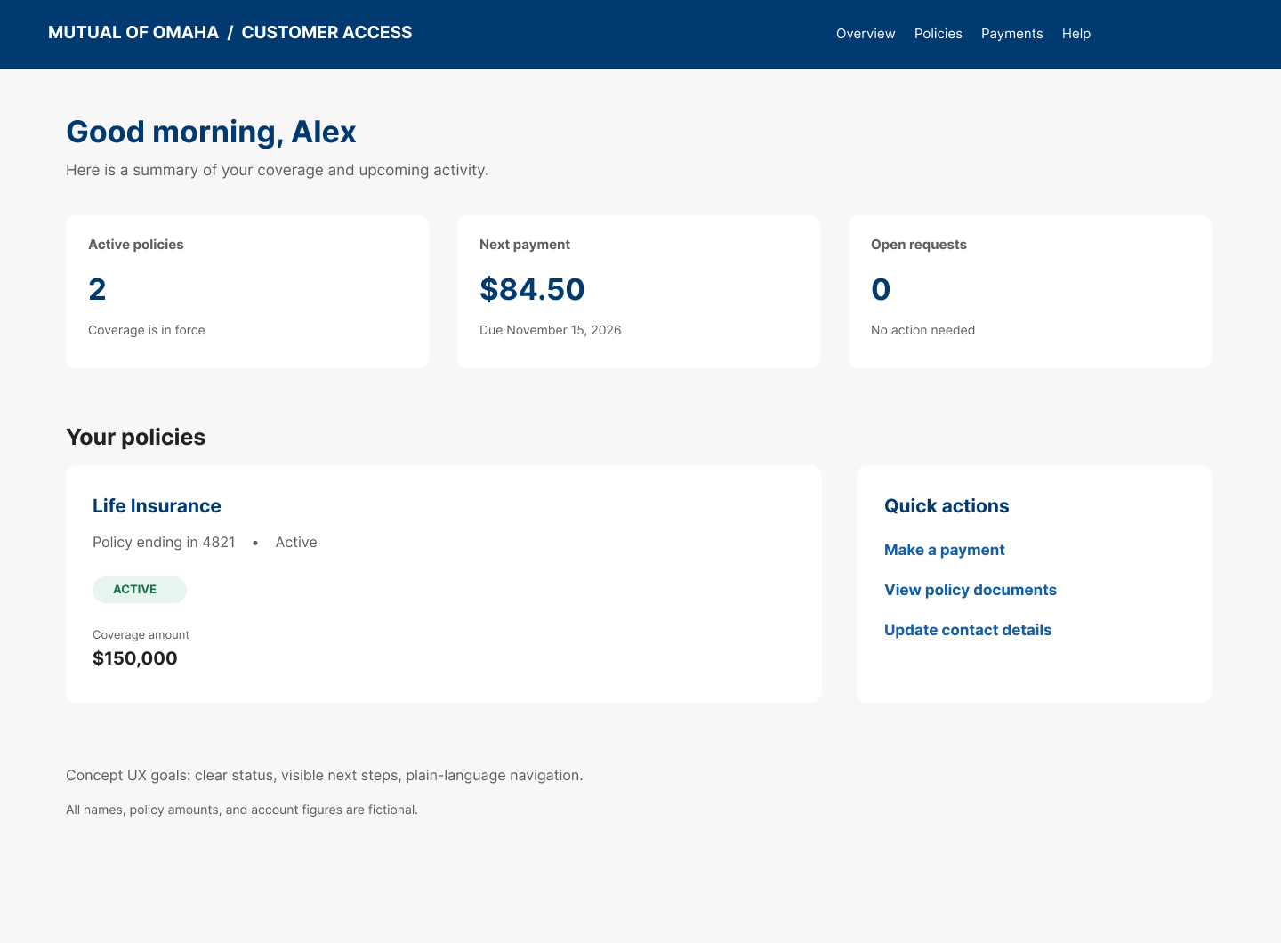
The overview is organized around what could matter immediately when someone signs in. The top presents active policies, the next scheduled payment, and outstanding requests; policy details and common actions follow below.
- Account status is written in words, not communicated by color alone, which is easier to interpret and a clearer basis for accessible status components.
- Information hierarchy — summary cards give a quick read before more detailed policy information.
- Quick actions such as making a payment, viewing documents, and updating contact details are grouped in one predictable area.
- Content grouping keeps related information together to reduce visual searching.
05Payment review
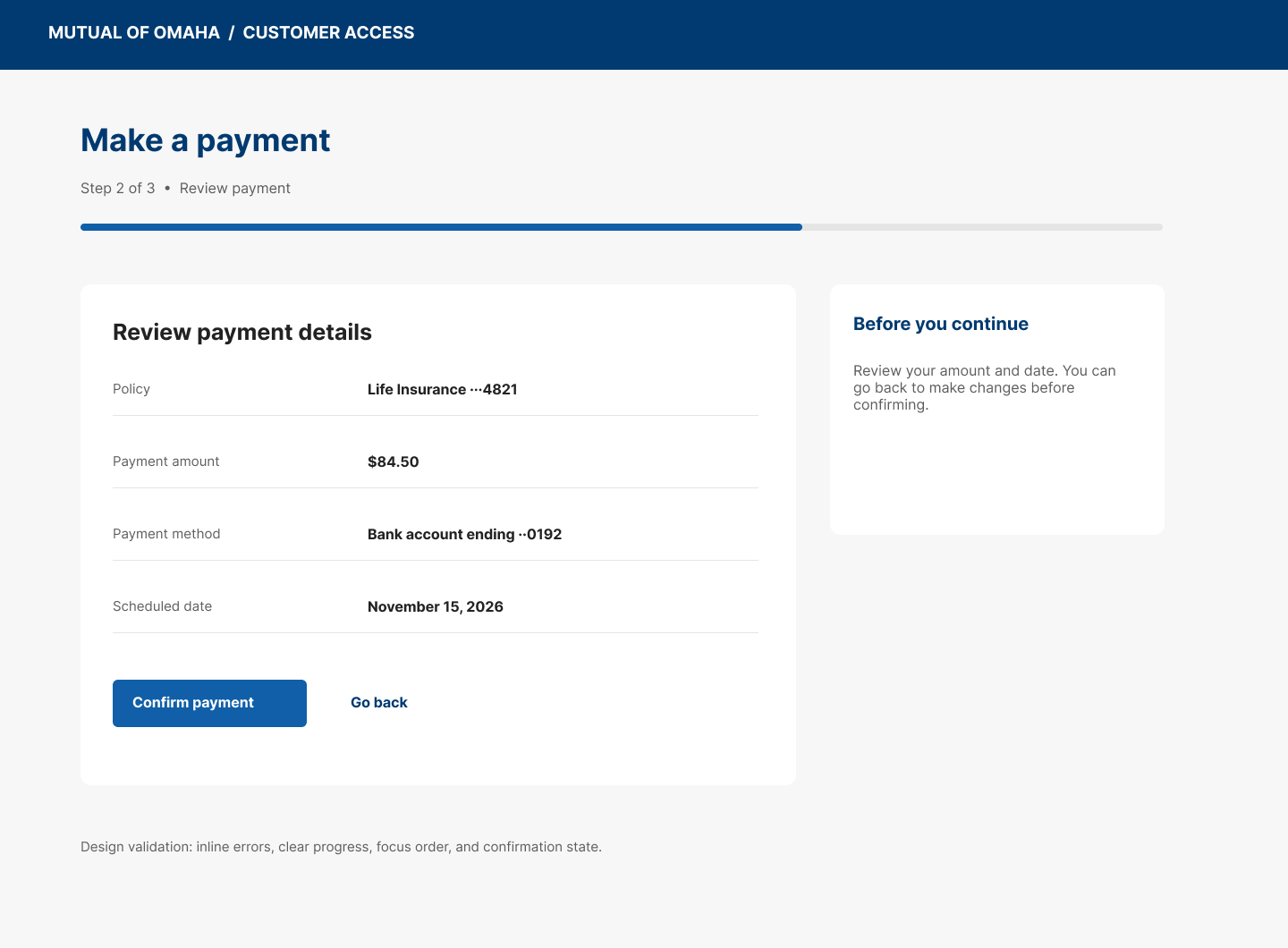
Payment steps deserve particular attention because they involve sensitive information and actions customers need to feel confident about. This screen explores the review stage of a proposed three-step process: policy, amount, method, and scheduled date, shown before the customer confirms.
- Visible progress — a step indicator shows where the customer is in the proposed flow.
- Review before confirmation — the key details sit together so they can be checked before acting.
- Clear next steps — the primary action is distinguished from the option to go back.
- Error prevention — the review step reduces uncertainty; a full build would still need input validation, error recovery, and a confirmation screen.
This Figma deliverable currently shows the payment-review stage only.
06Mobile
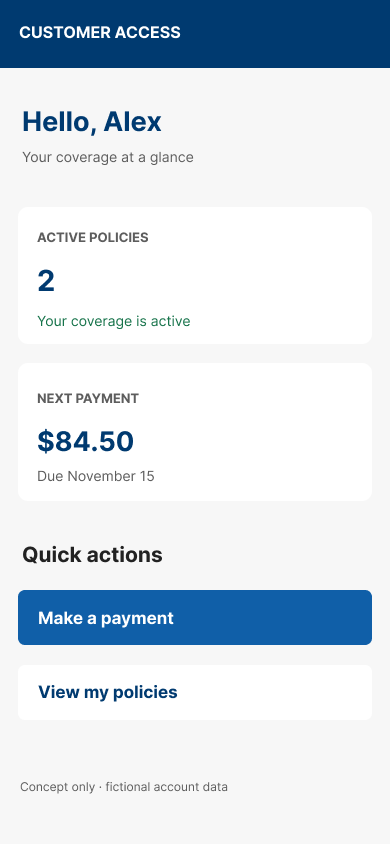
The mobile concept adapts the overview to a narrower screen by prioritizing essential information and immediate actions. Coverage and payment summaries stack as vertical cards, followed by prominent buttons for common tasks, keeping the same visual language as the desktop concept.
- Vertical hierarchy — account status and payment information come before secondary tasks.
- Touch-friendly actions — primary buttons use generous targets for comfortable mobile use.
- Consistent visual language — color, type, and card treatments connect mobile to desktop.
07Accessibility considerations
Accessibility was considered as part of the visual direction — status communication, text hierarchy, spacing, and predictable controls. Because this is an initial concept, these are design targets, not a claim that the screens have passed a formal audit.
- Review text, button, and status contrast against WCAG 2.2 AA before production.
- Communicate important states with words, not color alone.
- Specify visible keyboard focus for links, inputs, and controls.
- Use descriptive labels and text-based validation messages.
- Size touch targets adequately on mobile.
- Support logical reading order and readable content across viewports.
08What I would validate next
The next step would be to evaluate the experience with representative users — whether they can identify coverage status, find an upcoming payment, review payment details accurately, and navigate common tasks without confusion. Proposed usability tasks:
- Find out whether a policy is active.
- Identify the next payment amount and due date.
- Locate the option to make a payment.
- Review the payment method and scheduled date.
- Explain what would happen after selecting the primary payment action.
I would measure task completion, navigation errors, time on task, points of confusion, user confidence, and accessibility issues. These are proposed methods — no user testing has been completed, and no usability metrics are reported.
09Reflection
This project explores how visual design decisions shape the way people understand and move through an account experience. The most useful takeaway is treating clarity as part of the design system itself: hierarchy, consistent labels, reusable components, and predictable actions all add up to a more understandable interface. The current work establishes a visual foundation and several key screens; a complete product would need additional flows, interaction states, user research, accessibility validation, and development collaboration.
Independent, AI-assisted portfolio concept. No production deployment, completed user testing, or measured business outcomes are claimed.
10Explore the design
View the editable Figma file to explore the design foundations, reusable button components, desktop screens, and mobile layout. This is a design file, not a fully connected interactive prototype.
Screens and artifacts