Independent concept · Figma · 2026
IIA Membership Experience Concept
Independent UX/UI concept I created for the Institute of Internal Auditors UX Designer opportunity. It is not affiliated with or commissioned by IIA, it is not production work, and it has not been tested with IIA members.
01The challenge
Explore how a multi-step membership signup for a professional association could make plan options, profile entry, review, and confirmation clear and easy to move through.
02What I set out to show
Clear information hierarchy, reusable components with variants, Auto Layout, form validation states, predictable step-by-step navigation, and basic accessibility practices.
03Component system
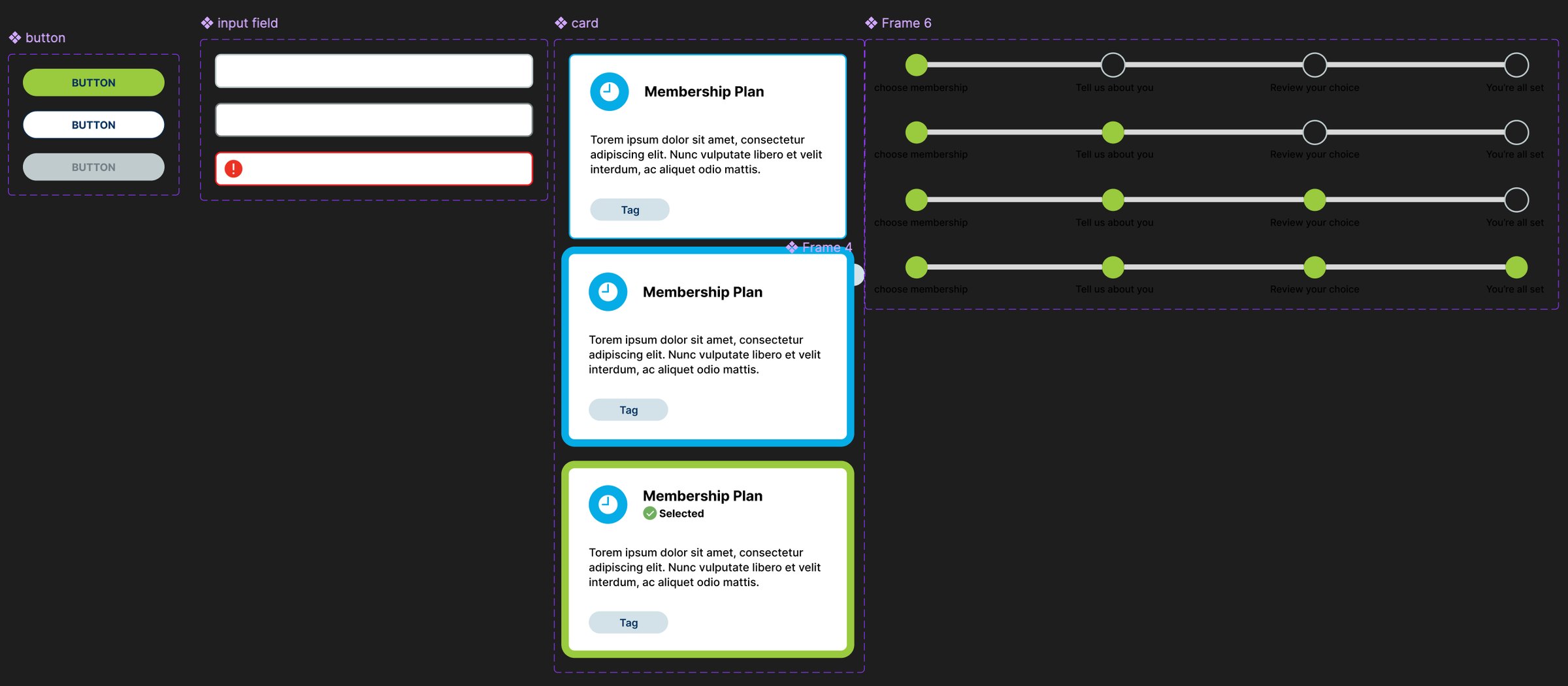
Before designing screens, I built a small reusable component library in Figma:
- Button: primary, secondary, and disabled
- Text input: default, focus, and error
- Membership plan card: default and selected, built with vertical Auto Layout so it resizes with its content
- Progress stepper: one variant for each of the four steps
Every screen in the flow is built from instances of these components, so a change to a source component carries through to every screen.
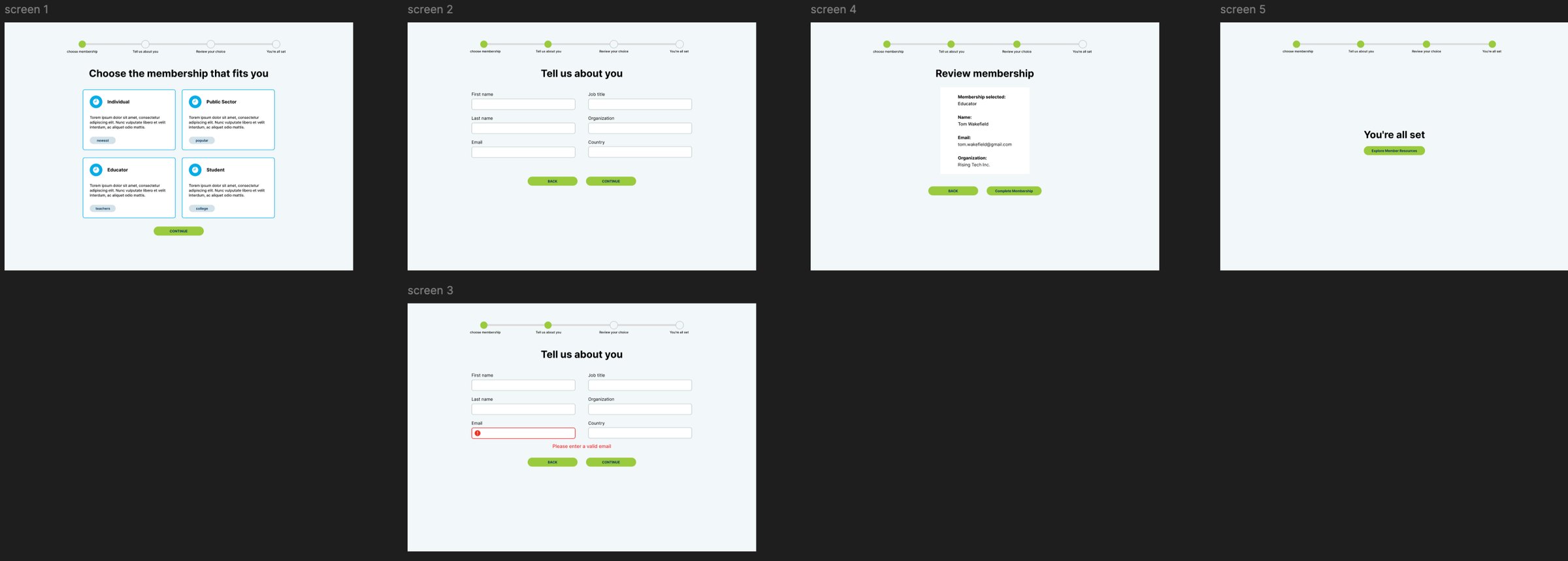
04The flow
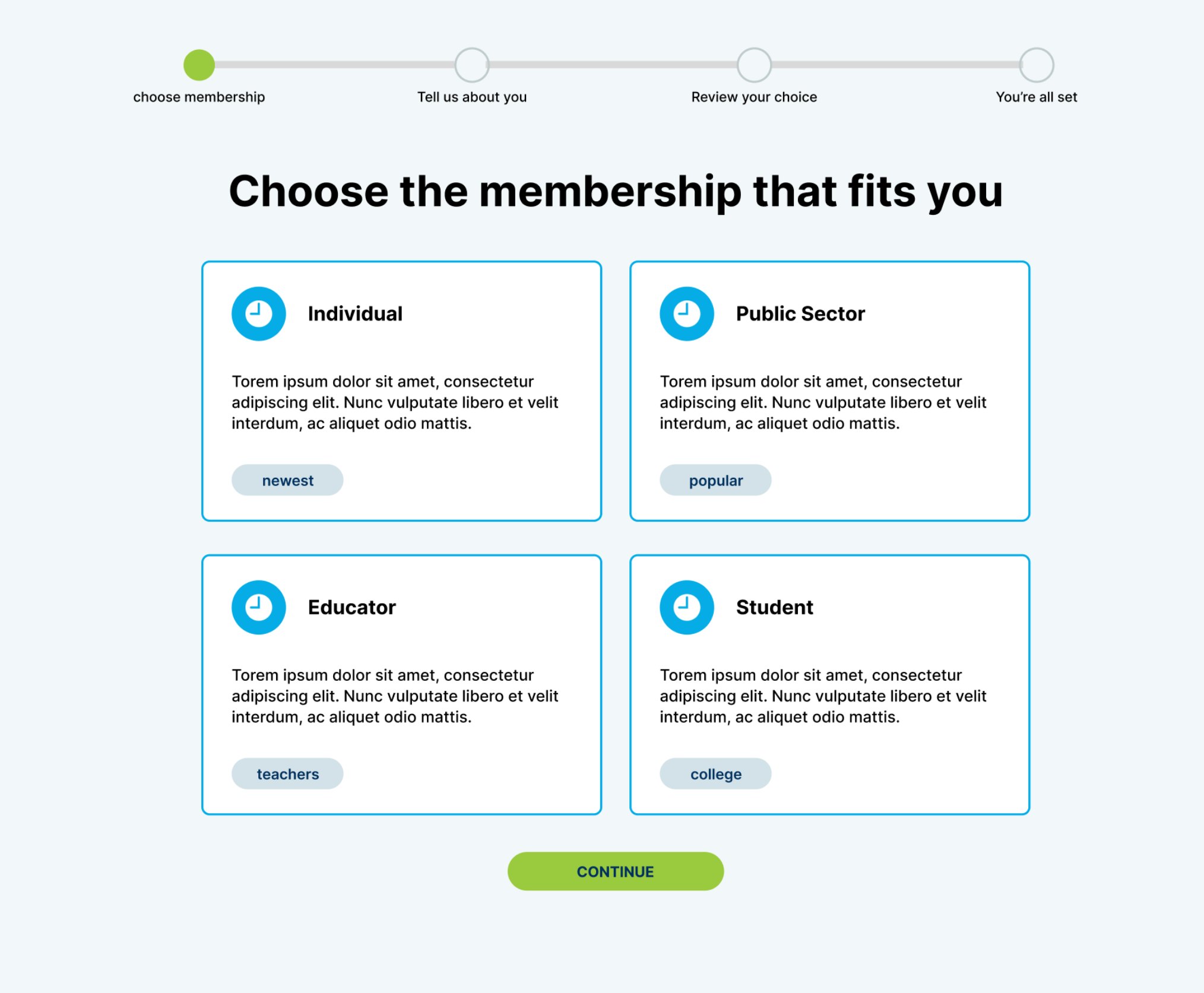
Choose a plan, tell us about you, review your choice, and confirmation. Each step has one primary action and a Back option, and the stepper labels every step in plain language so people always know where they are and what comes next.
05Accessibility decisions
- The email error uses an icon, a red border, and a plain-language message, so it does not rely on color alone.
- The selected plan card adds a check icon and a "Selected" label, not just a border color change.
- Every form field has a visible label above it, not placeholder text that disappears.
- Spacing follows an 8, 16, 24, 32 px scale to keep layouts consistent.
06What I would do next
Replace the placeholder plan descriptions with real membership details and pricing, add prices and edit links to the review step, design a mobile layout, and link a clickable prototype.
Screens and artifacts