FAA PBCS Monitoring Report — Redesign
Deck Redesign · Federal Aviation
2026
Source
Federal Aviation Administration, PBCS Monitoring Program
Format
PowerPoint, 28 slides, 16:9 widescreen
Slides Redesigned
Full deck
Role
Presentation Designer

Final redesigned cover
The Brief
The FAA's Performance-Based Communication and Surveillance Monitoring Report is a recurring technical document tracking aircraft data link performance across the Oakland, Anchorage, and New York oceanic control regions. It reports on the reliability of the communication systems — CPDLC, ADS-C, FANS over Iridium, and FANS over SwiftBroadband — that keep flights safely separated over the world's largest stretches of controlled airspace. The original deck was a government PowerPoint built around an aging template: a split-panel cover with a stock aviation photograph, default typography with no meaningful hierarchy, and no visual system to help readers navigate ten sections of dense performance data. The data inside was rigorous. The presentation of it was not.
The Challenge
Technical aviation reports have a specific audience and a specific job. The readers are FAA program managers, airline operators, equipment manufacturers, and ICAO representatives — technical professionals who need to scan performance tables, compare results across media types and control regions, and identify trends without being slowed down by the document itself. The redesign had to make a data-dense deck navigable without stripping out any of the technical content the audience came for. It also had to introduce a coherent visual identity to a document that previously had none.
Before & After
Title slide
Before

After

The original cover split the slide down the middle — title text on a plain white left panel, a stock aviation photograph on the right, with the FAA seal and wordmark squeezed into the top-right corner. Nothing was weighted intentionally. The redesign uses a full-bleed dark navy background with the aircraft photograph integrated into the layout rather than segregated from it. A clear three-level hierarchy separates the agency identification, report title, and document metadata. Three location pills — Oakland, Anchorage, New York — replace the original's text-only FIR references and give the reader the scope of the report before they read a single line of copy.
Section divider
Before
After
The original had no section dividers — every slide used the same template regardless of whether it was a cover slide, a data table, or a transition between sections. The redesign introduces full-bleed dark navy section dividers with a numbered treatment. An oversized section number acts as a visual anchor, the section title is set large and bold in the lower-left, and a running subtitle identifies the report and data period. The numbering system carries through all ten sections, giving readers a consistent location marker throughout the deck.
Performance data table
Before
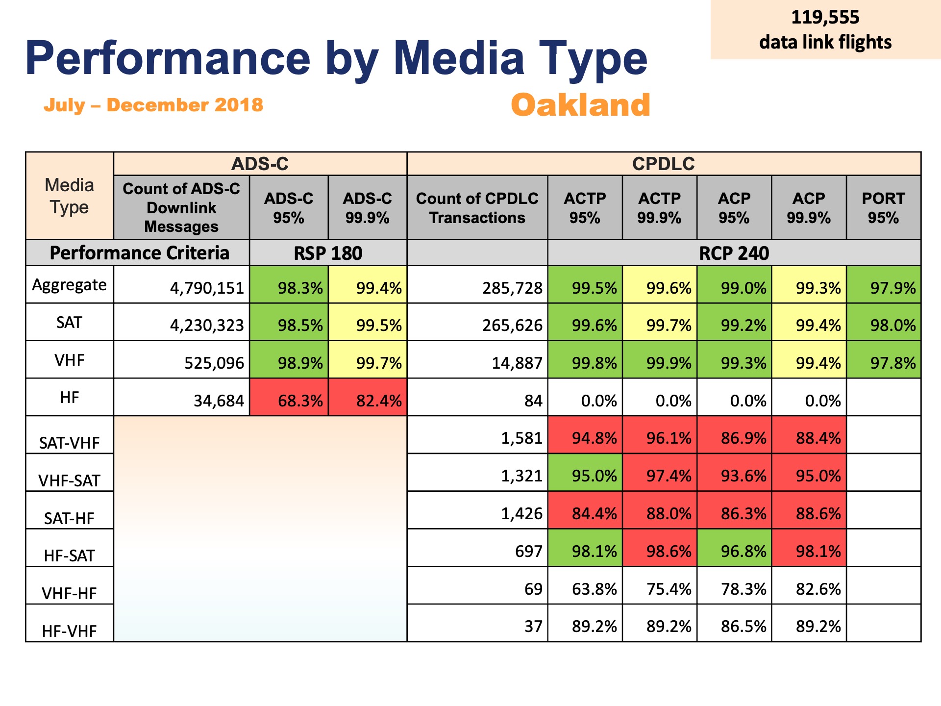
After
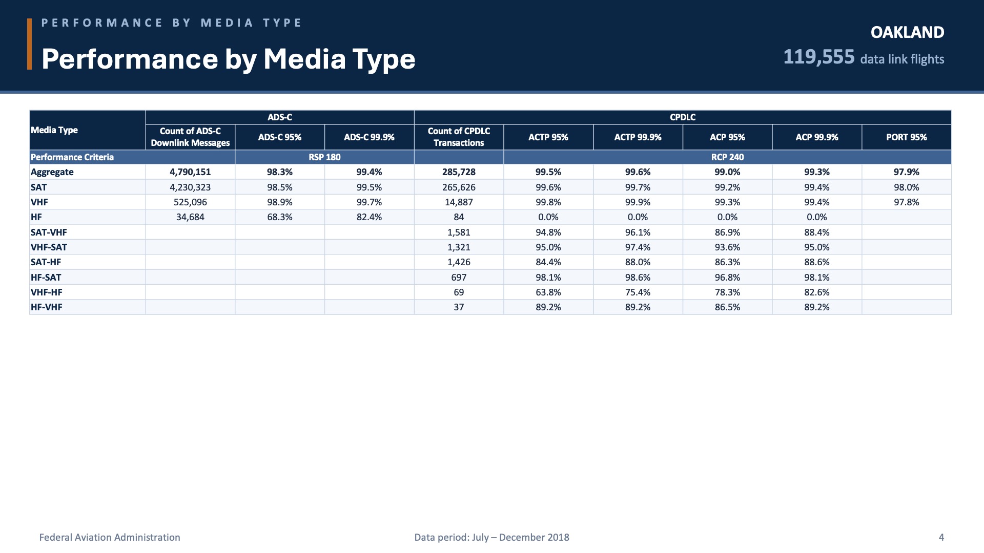
The original performance tables used default PowerPoint table styling — uniform borders on every cell, identical font weight throughout, and no visual distinction between the column group headers, the performance criteria row, and the data rows. At the table's native size, the type was small enough to require zooming. The redesign rebuilds the same table with grouped column headers for ADS-C and CPDLC, a distinct treatment for the Performance Criteria row, right-aligned percentage values, and a stat callout anchoring the key figure — 119,555 data link flights — in the top-right corner where it orients the reader before they enter the table.
Content slide with key point callout
Before
After
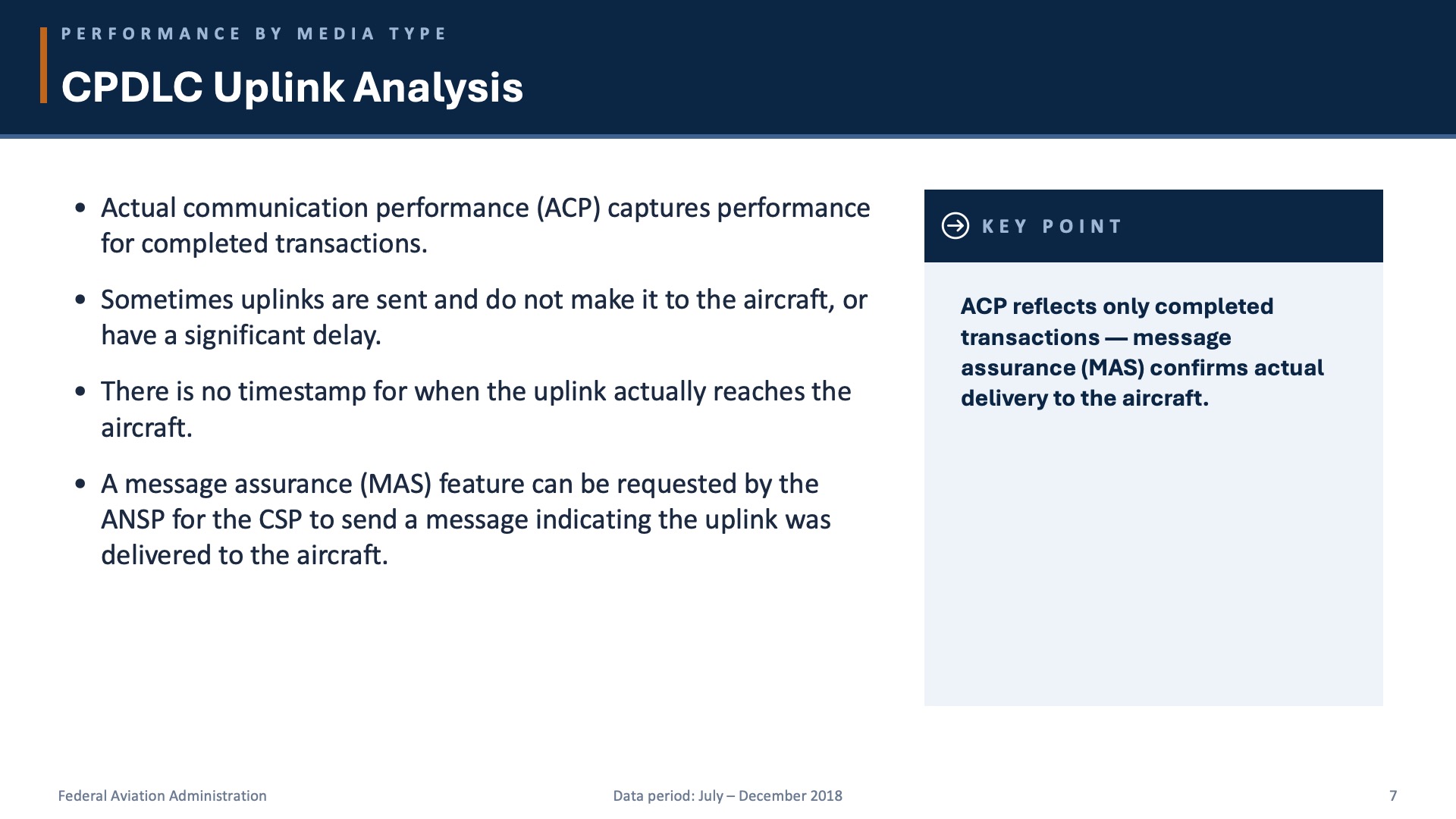
The original analytical slides used a flat bulleted list at a single weight, with no way to distinguish the primary finding from the supporting detail. The redesign introduces a two-column layout: the body content on the left in a clean bulleted structure, and a "Key Point" callout box on the right that surfaces the single most important takeaway from the slide. A section breadcrumb in the header confirms where the reader is in the deck at all times.
The Approach
The redesign built a visual system from scratch using the FAA's existing navy as the dominant color and a controlled amber-orange accent reserved for data emphasis and key callouts. A consistent header treatment — section breadcrumb in small caps, slide title at large weight — replaced the original's inconsistent titling. A ten-section numbered divider system gave the deck navigable structure for the first time. Every data table was rebuilt with typographic hierarchy separating headers, criteria rows, and data rows. A "Key Point" callout module was introduced on analytical slides to surface the primary finding without requiring readers to parse every bullet. Charts that existed in the original were retained and restyled to match the deck's visual identity. The work preserved every piece of technical content — every statistic, every metric, every footnote — while making the document capable of doing its actual job.
Additional Slides from the Final Deck
The Result
A 28-slide federal aviation monitoring report with a coherent visual identity, navigable section structure, and data tables that an FAA program manager can actually scan at speed. The redesign demonstrates that technical government documents can carry rigorous content and a professional design language at the same time — and that the two are not in conflict.
Next project →
Tritium Handling — Technical Redesign