01Independent concept · Digital campaign · 2026
The Fall Layering Edit
An Independent Fall 2026 Digital Campaign Inspired by Abercrombie & Fitch
One creative direction, adapted into a website, mobile, email, and paid social campaign.
Independent portfolio concept created for demonstration purposes. Not commissioned by, affiliated with, or endorsed by Abercrombie & Fitch Co.
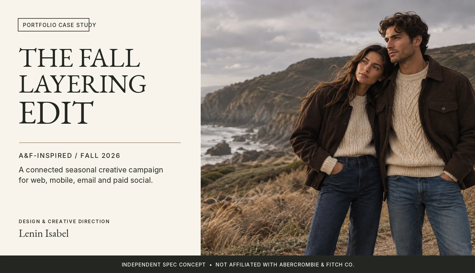
The Creative Challenge
How can one seasonal fashion story translate consistently across every digital customer touchpoint?
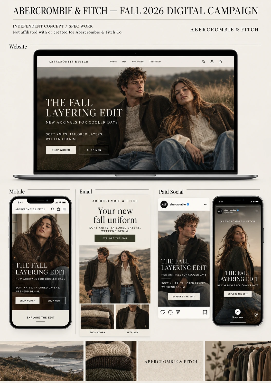
The Fall Layering Edit is an independent concept exploring how an editorial retail campaign can maintain a recognizable identity while adapting to the different requirements of desktop shopping, mobile browsing, promotional email, and paid social advertising.
The creative challenge was to build one cohesive campaign system, not simply a collection of unrelated advertisements.
Building the Seasonal Narrative
The Fall Layering Edit centers on an approachable idea: versatile everyday layers for cooler weather.
Soft knitwear, textured outerwear, and relaxed denim establish the seasonal product story. Natural coastal scenery, warm neutrals, and understated typography reinforce a casual yet elevated visual identity.
The campaign uses consistent photography, messaging, color relationships, and typography to maintain recognition across channels.
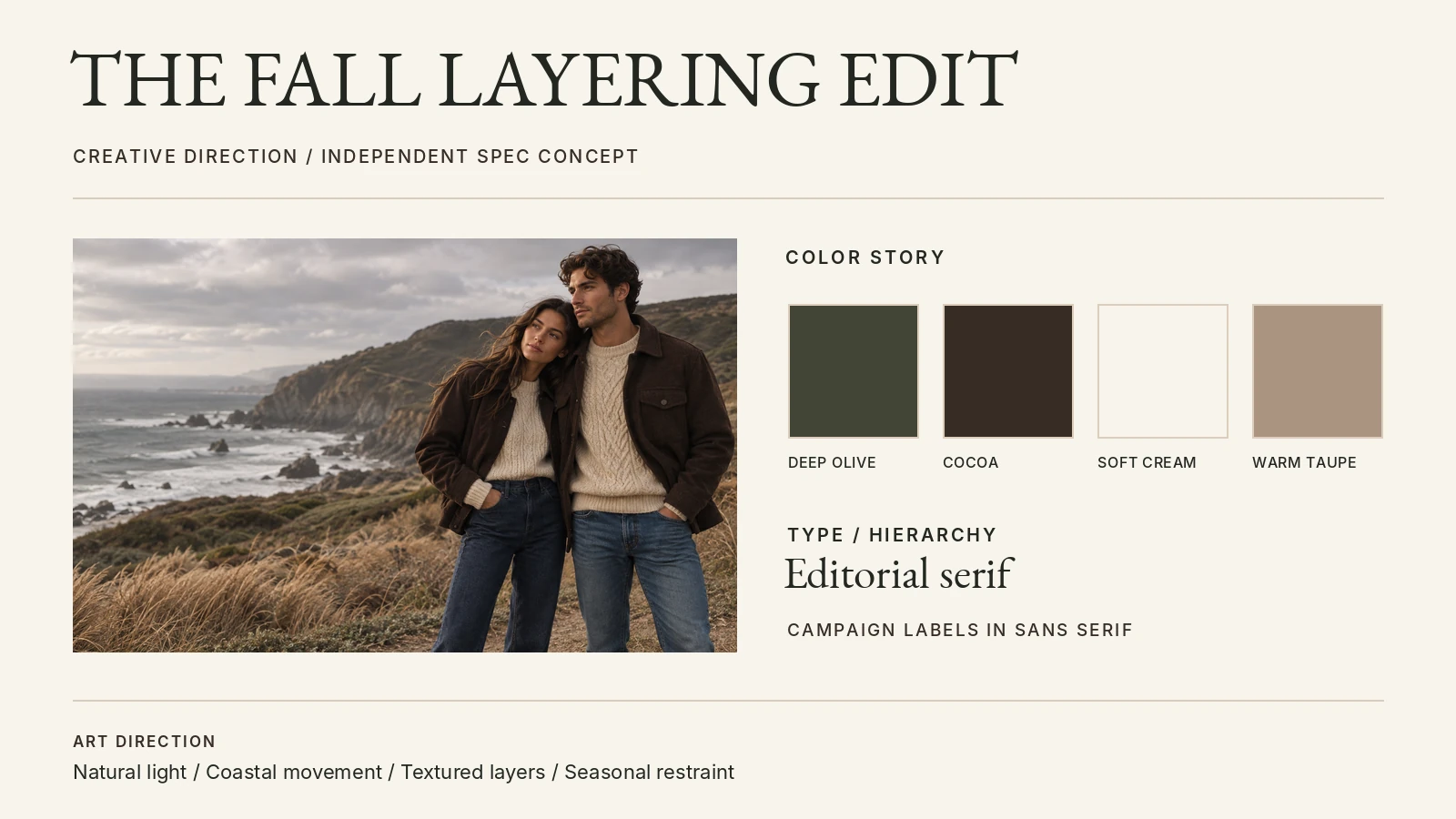
Concept campaign colors
- Deep Olive
#424536 - Cocoa
#362C25 - Soft Cream
#F7F4ED - Warm Taupe
#A99481 - Dark Ink
#232721 - Sand
#DCCDBB
These are the concept campaign colors, not official Abercrombie & Fitch brand colors.
An editorial serif treatment creates a sense of seasonal storytelling, while clean supporting typography keeps promotional messages and calls to action readable. Warm neutrals connect the photography with the apparel's visual textures.
The Digital Storefront
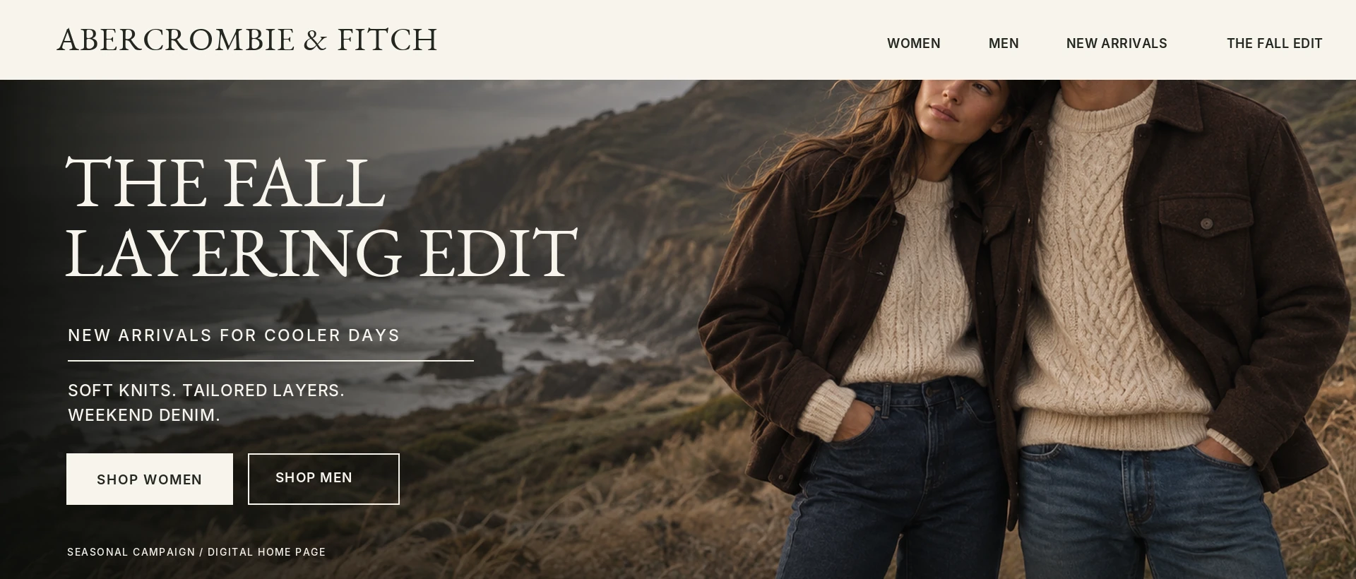
The homepage hero establishes the campaign's central message immediately: The Fall Layering Edit.
The composition balances lifestyle photography with a clear typographic hierarchy, allowing the product story to remain prominent without competing with the featured apparel.
Paired “Shop Women” and “Shop Men” calls to action provide straightforward category entry points, while the supporting copy reinforces the seasonal product narrative.
- Clear campaign hierarchy
- Prominent category-based calls to action
- Photography and typography balance
- Consistent seasonal messaging
Designed for Smaller Screens
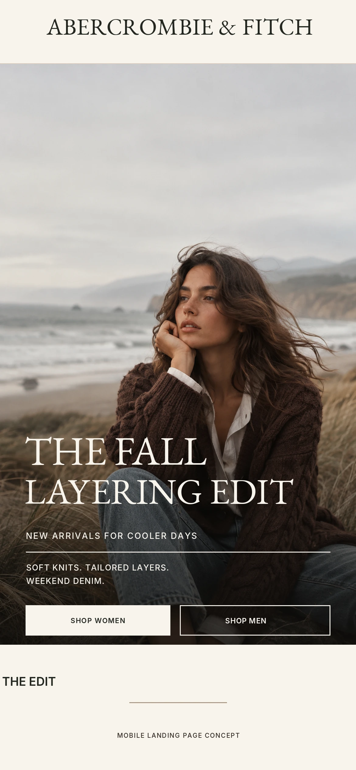
The mobile adaptation carries the same campaign identity into a narrower layout.
The editorial imagery and seasonal headline remain the visual focus, while content is arranged vertically to support quick scanning. Large calls to action and a simplified hierarchy reinforce the mobile shopping experience.
Rather than introducing a separate visual identity, the mobile design extends the same campaign system.
- Vertical content hierarchy
- Consistent campaign imagery
- Readable mobile typography
- Clear calls to action
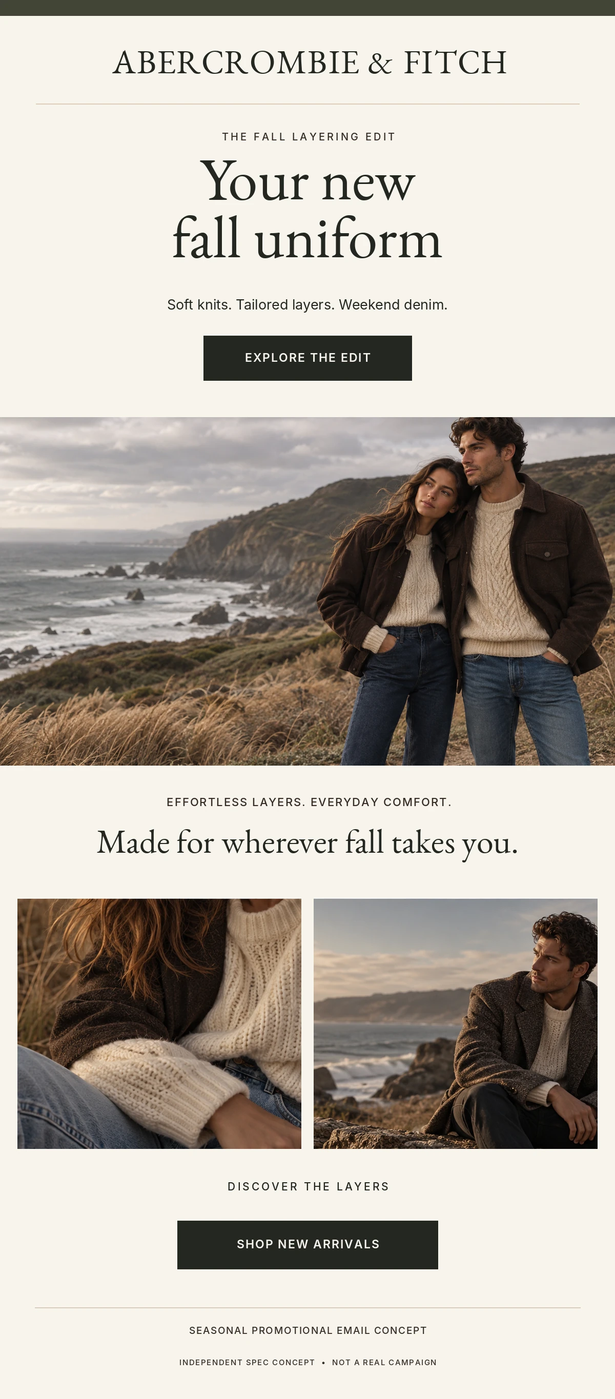
Bringing the Campaign to the Inbox
The promotional email introduces the seasonal collection through the message “Your new fall uniform.”
The layout follows a clear progression: brand recognition, campaign headline, primary call to action, lifestyle imagery, and supporting product storytelling.
The design prioritizes quick comprehension while maintaining the campaign's editorial character. Repeated visual cues connect the email experience to the website and paid media creative.
- Strong headline hierarchy
- Prominent primary CTA
- Modular promotional content
- Clear product storytelling
- Visual continuity with other channels
Translating the Story into Social Creative
Across all three formats, the typography, palette, and photography stay constant. What changes is the format: the crop, the amount of copy, and whether a call to action appears.
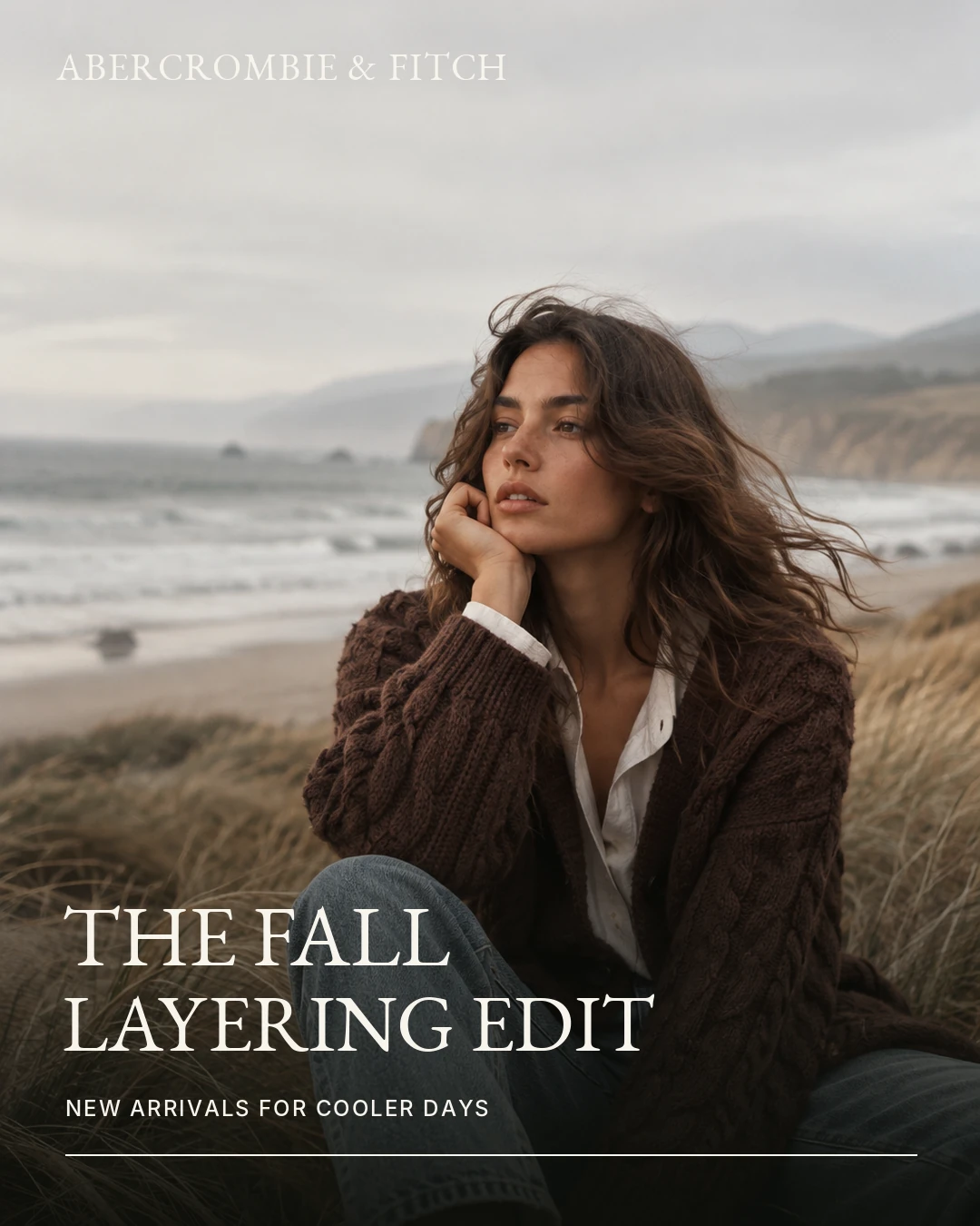
Feed Advertisement
The feed creative combines campaign imagery, a concise seasonal headline, and a short supporting line. The composition is designed to communicate the collection's visual identity during a quick scroll.
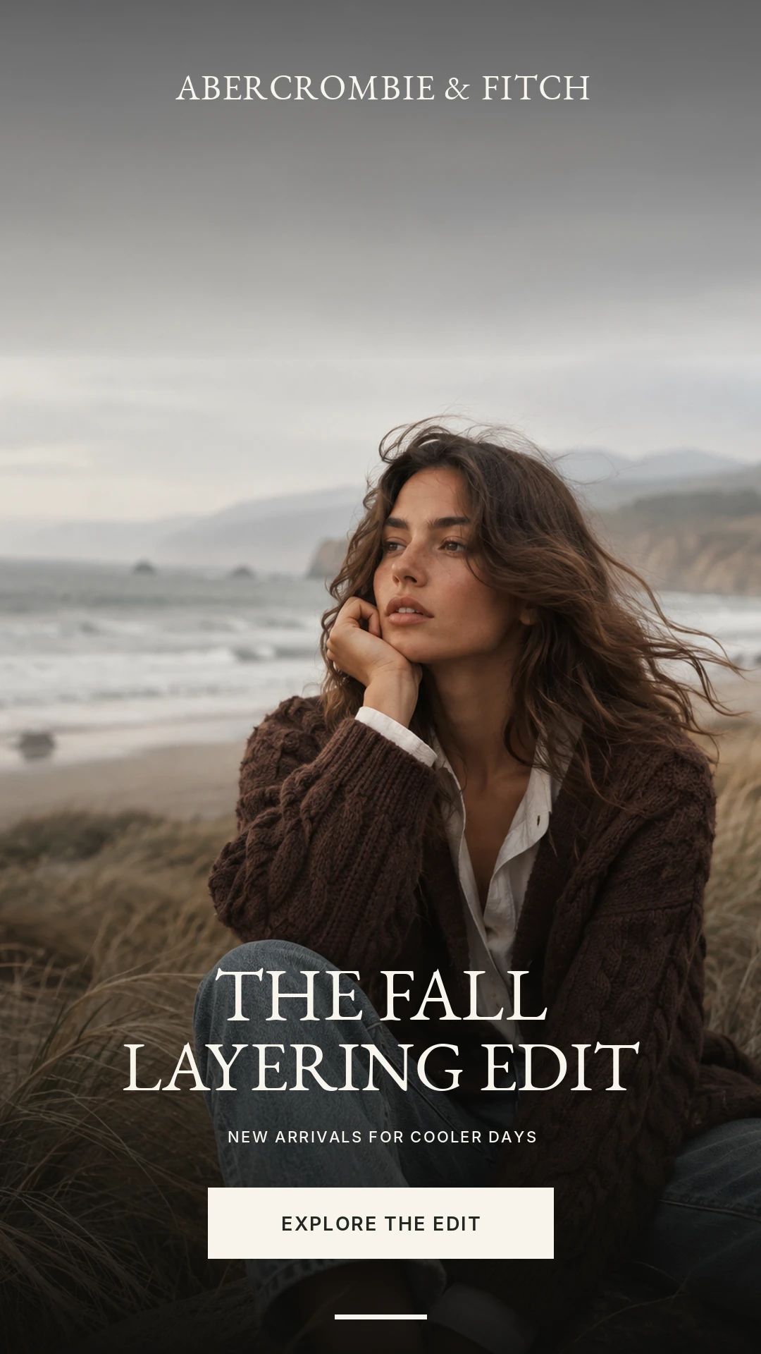
Story Advertisement
The vertical Story format emphasizes immersive lifestyle imagery, simplified messaging, and a prominent shopping action. The creative adapts the visual hierarchy to a full-screen viewing context.
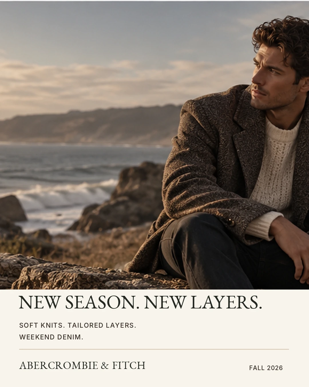
Alternate Feed Creative
The additional feed treatment explores how the campaign can support creative variation while retaining consistent seasonal messaging, color, and typography.
One Campaign. Multiple Touchpoints.
Website
Introduces the seasonal collection and directs customers to shopping categories.
Mobile
Maintains campaign recognition in a vertical, mobile-friendly experience.
Email
Reintroduces the product story through a concise promotional message.
Paid Social
Extends campaign awareness through feed and full-screen creative.
Designing a Connected Campaign
This independent exploration demonstrates how a single creative direction can be adapted across multiple marketing channels without losing its identity.
The project focuses on visual hierarchy, typography, cohesive art direction, responsive composition, and consistent product storytelling.
The resulting concept presents a connected digital campaign system across website, mobile, email, and paid social formats.
Campaign visuals include AI-generated editorial imagery and AI-assisted design production. This is speculative work; no live campaign was launched, and no campaign performance results are claimed.
Want to talk about campaign, web, or presentation design?
Start a conversation