Baldrige Performance Excellence — Redesign
Deck Redesign · Federal Program
2026
Source
National Institute of Standards and Technology, Baldrige Performance Excellence Program (2014)
Format
PowerPoint, 27 slides, 16:9 widescreen
Slides Redesigned
Full deck
Role
Presentation Designer

Final redesigned cover
The Brief
The Baldrige Performance Excellence Program's introduction deck is one of the most-used entry points to the Baldrige Criteria — a federal framework for organizational performance excellence used by thousands of businesses, nonprofits, health systems, and schools across the United States. The original was a 2014-era PowerPoint built on an aging NIST template: a white background, a decorative blue swoosh element repeated on every slide, default sans-serif typography, and flat bulleted lists as the primary content format throughout 27 slides. The program's reach — nearly 100 countries run quality programs based on the Baldrige model — deserved a visual presentation that matched its credibility.
The Challenge
The original deck had two distinct problems. The first was the template itself: the decorative swoosh and default styling had a 2008-era feel that worked against the program's authority. The second was structural: the entire deck used one layout — title plus bullets — regardless of whether the slide contained a leadership quote, a program statistic, a complex framework diagram, or a scoring table. Every slide looked and functioned identically. The redesign had to retire the template, introduce a design system that could flex across genuinely different content types, and do all of this while maintaining the institutional identity and federal register the program requires.
Before & After
Cover slide
Before

After

The original cover placed the presentation title in the lower-left third of an otherwise empty white slide, with the decorative blue swoosh in the top-right corner and the Baldrige and NIST logos at the bottom. Nothing was intentionally weighted. The redesign uses a two-panel dark navy and teal layout with the title and a descriptive subtitle on the left, and a connected-node network illustration on the right — a visual motif that carries through the entire redesigned deck and represents the systems interconnection at the heart of the Baldrige framework itself.
Quote slide
Before

After

The original devoted a full slide to a single Cargill executive quote, set as body text with no distinct treatment that signaled "this is a testimonial rather than a content point." The redesign converts the same slide into a 2×2 quote card grid, surfacing four executive and organizational leader testimonials simultaneously — one from manufacturing, one from education, one from management literature, one from healthcare. Each card is visually consistent with a teal left-border accent and the attribution set in weighted teal type.
Content slide
Before
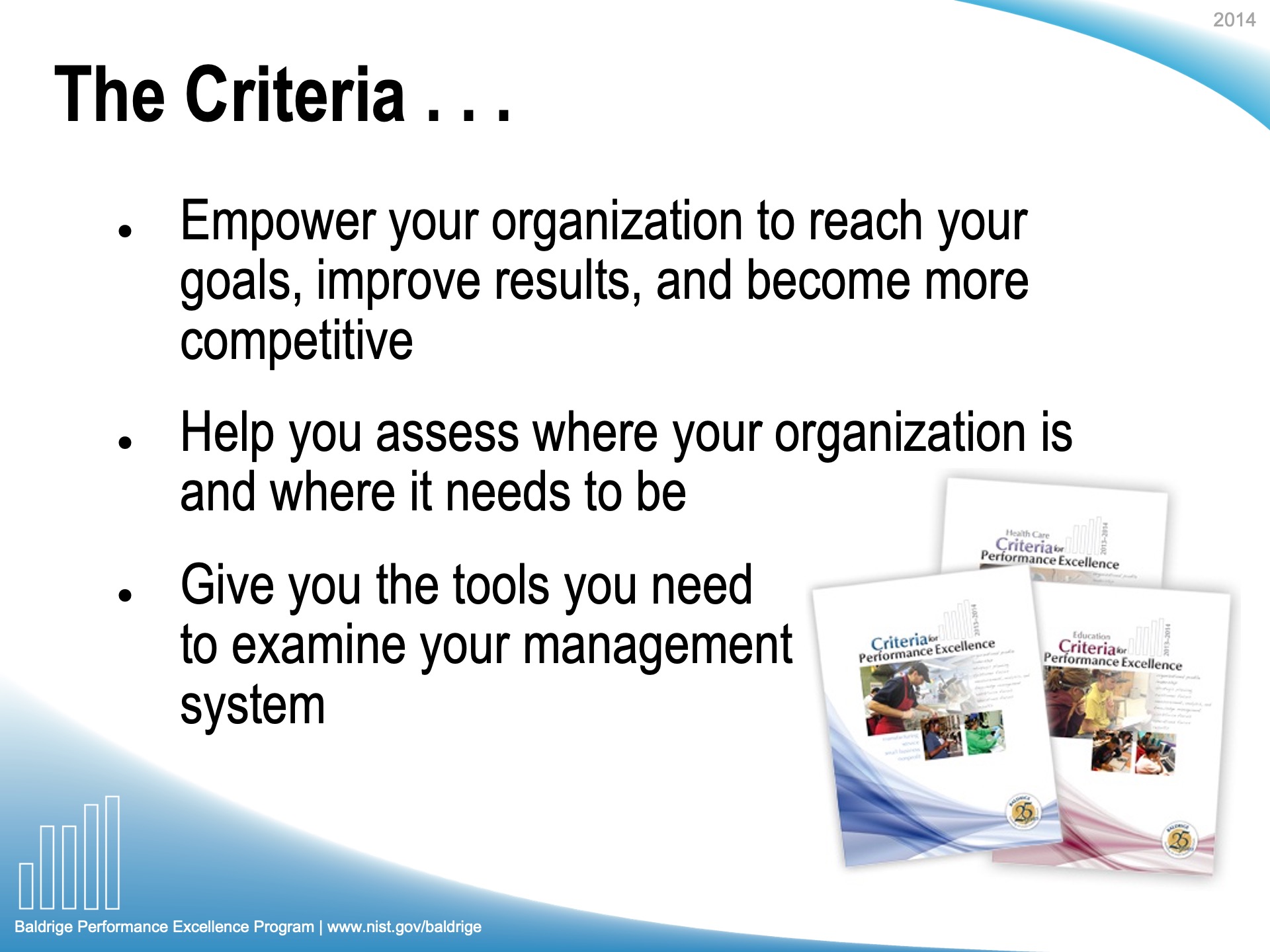
After
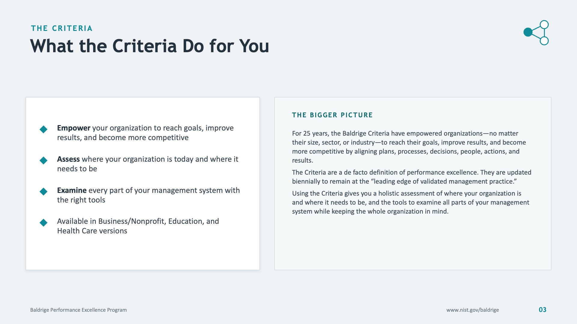
The original content slides used full-width bullet lists at a single weight, with title and body as the only two visual elements. The redesign introduces a two-column card layout: the left panel holds the primary content with bold-highlighted action verbs replacing flat bullet formatting, while the right panel carries a "The Bigger Picture" context box that gives the reader a broader frame for what they're reading. Section breadcrumbs in small caps replace the original's standalone slide titles.
Data and scoring slide
Before
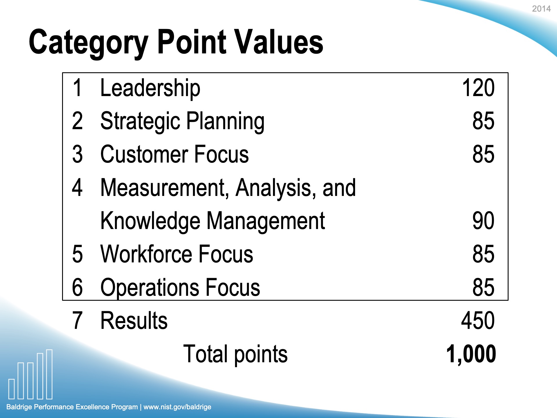
After

The original Category Point Values slide listed the seven Baldrige scoring categories and their point values as a plain text table — number, category name, points — with no visual indication of the relative weight of each category. Category 7 (Results) is worth 450 of the 1,000 total points, nearly double any other category, but nothing in the original made that legible. The redesign converts the same data into a horizontal bar chart where the lengths reflect point values, paired with a "45%" large-number callout in a dark teal card that anchors the key insight immediately. The same data now tells its own story.
The Approach
The redesign replaced the entire template with a system built around three elements: a dark navy anchor color, a teal accent used consistently across section markers, callout cards, and interactive diagram elements, and a connected-node network motif that appears on the cover, section transitions, and the closing slide. A section breadcrumb system in small caps was introduced above every slide title, so the audience always knows which of the program's major topic areas they are in. Content layouts were differentiated by type: flat bullets became card pairs with context columns; standalone statistics became large-number callout cards; the framework diagram was rebuilt as a cleaner structural layout with an annotation column explaining each element. The scoring table was converted to a bar chart. The closing slide uses a half-panel split — the network motif on the left, contact and resource information on the right — giving the presentation a visual bookend that matches the cover. Throughout, the Baldrige program's institutional identity and federal register were preserved: the NIST affiliation, the program URL, and the program name appear consistently in the footer across all 27 slides.
Additional Slides from the Final Deck
The Result
A 27-slide federal program introduction that retired a decade of accumulated template debt and replaced it with a design system that serves the diversity of content inside the deck. The redesign demonstrates that a federal program document can maintain its institutional authority while presenting its content in a visual register that matches the seriousness of the framework it introduces. The connected-node motif that runs through the deck earns its place: it represents the systems interdependence that is the actual conceptual core of the Baldrige Criteria.
Next project →
Lumenpath Analytics — Board Update